The best candidate roundup I’ve seen is Worcester Magazine’s. Here is a link to the 508 interviews of the City Council candidates. I haven’t seen signs for all of the candidates, so the “29” above is more aspirational than descriptive.
Mayor/City Council
Bill Coleman
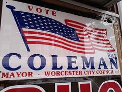
I haven’t seen any Coleman signs out this year, so here’s one from a couple years back. Among his many passions is putting up huge American flags, so this is a very appropriate design. It also scores him 50 stars.
Bill Feegbeh
I haven’t seen any media or campaign materials from him.
Konnie Lukes
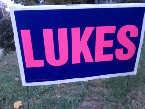
When you have been running successfully for local office for 30 years, then you too can put just your last name on your sign. Pink + navy = feminine + professional. A no-nonsense sign for a lady who is “not going to be part of this nonsense“.
Joe Petty
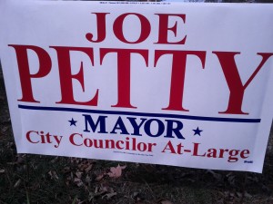
I don’t like the line in the middle of this sign. I don’t like all of the serifs on all these capital letters creating a tangle across this sign. I don’t like that two offices are listed on the sign, but I guess that’s more the fault of our confusing election system. I must, however, award this sign two stars.
City Council, At-Large
Mo Bergman
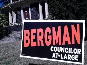
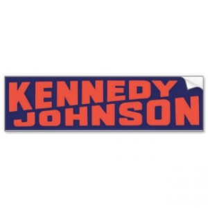
When this sign first appeared in late summer, several observers emailed me complaining it was too “spooky.” But by the time the election rolled around, the orange-and-black fit right in with the foliage and jack-o-lanterns. Mo told me it was also inspired by an old Kennedy/Johnson sign, though the image below was the closest I could find for these colors and that team. I cannot in good conscience award this sign any stars, but it’s the best of the challengers’.
Mesfin Beshir
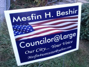
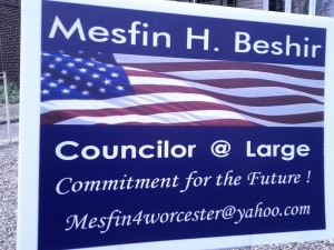
There are rumored to be four versions of this sign, but I could only find these two. I really dislike the stretching of the flag image. The idiosyncratic @ and punctuation also distract in ways I don’t think the candidate intends. I do like that his email is big and visible. Mesfin, if you are reading this, has anyone emailed you because of this sign? Overall, I give it at least 32, maybe 34, stars.
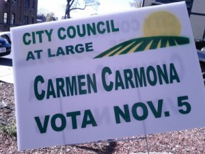
Neither I nor Worcester Magazine was able to get in touch with this candidate’s campaign. But here’s a sign, reminiscent of Obama’s “sunrise over a striped field/road” logo. Reminds me of chilly mornings in Wyoming, hiking into the sunrise. “Vota” is the only Spanish I’ve noticed on a campaign sign.
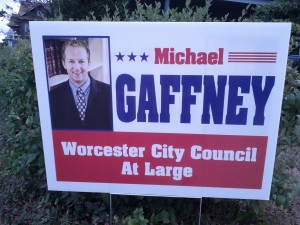
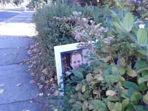
Mike Gaffney
Who’s that hiding in the bushes? It’s Mike Gaffney! Another unique design for this race. I could complain the overall design, but let’s be honest, the photo is what grabs all our attention. I think it’s a little small for a sign people are supposed to see while driving by. Gaffney’s a lawyer, and this looks a lot like an ad on the back of the phone book. There are the law books, classing things up. There is the button-down shirt with a suit, classing things down. Mixed messages. A three star design.
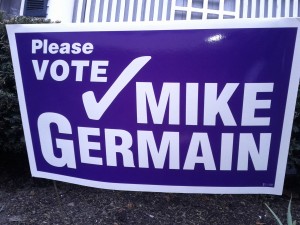
Mike Germain
The “Please” is a nice human touch by a candidate who, whatever his faults, is always open to make a human connection. I am not happy about the purpleness of the sign, but the overall design is much cleaner and better than in previous campaigns. Mike Germain: learning from his mistakes and moving forward.
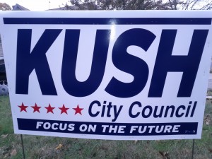
Peter Kush
Anecdotally, the most-stolen sign of the season. Possibly because a few folks resent him, possibly because “Kush” is the name of a kind of marijuana the youth are into. A mildly awkward sign, but really what we see here is the slogan “Focus on the future.” As someone who finds the past and present of Worcester less-than-inspirational, I can back that sentiment. Five stars.
Rick Rushton
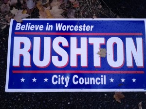
I think this is the sign Kush’s aspires to be, and in fact I will give this six stars. The slogan suggests Worcester as Brigadoon, or maybe Santa Claus. The two red lines create an image of Rushton, like Worcester, as a broad Democratic expanse between thin bands of Republican suburbs.
Kate Toomey
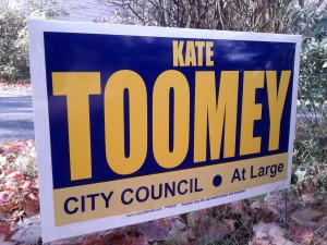
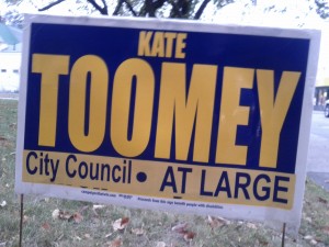
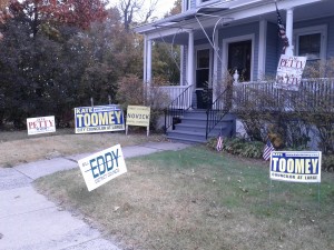
What is that ray of sunshine coming out of the dark night sky? It’s Kate Toomey! She’s had busier/uglier versions of this in the past, but this year I’ve mostly seen the two above, which I like best.
City Council, District 1
Tony Economou
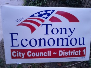
At first glance, the American flag is providing shelter for this patriotic candidate. At second glance, one wonders why there is a big irregular chunk cut out of the right edge of the flag, four stripes trimmed from the bottom, and 46 stars cut out of the blue field. I am all for stylized flags, but this is ridiculous and distracting. The rest of the sign is also a mess, with the thin serifs an unhappy contrast with the rest of the design, and the “1” too close to the border of the box. The tiny “Vote” pushes the awkwardness to the point of being charming. Four stars.
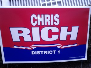
Chris Rich
The curves and keystones here are subtle enough to be interesting, rather than silly. And I love the suggestion of patriotic bunting. Man, this D1 race is all about the patriotic imagery.
City Council, District 2
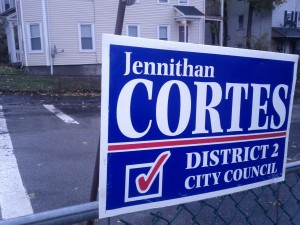
Jennithan Cortes
If you really want to put some little graphic on your sign, a checkbox is as good as anything. Lots of moving pieces, but they all work.
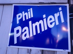
Phil Palmieri
Say what you will about Councilor Palpatine, but the man has panache. He wears a turtleneck to Council meetings and looks good doing it. Just the candidate’s name, at a jaunty angle. See the School Committee signs for examples of people who get this exactly wrong. See also Womag’s candidate photos, in which Palmieri stands out by himself leaning at a jaunty angle. He does it His Way. More than one person has written me saying this is the best sign of the season.
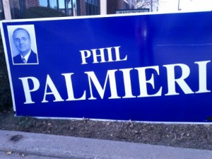
I’m disappointed in the oversized sign below, with the tiny, low-contrast photo, and the angled letters looking awkward rather than confident.
City Council, District 3
George Russell
He’s running unopposed, and I haven’t seen any signs for him.
City Council, District 4
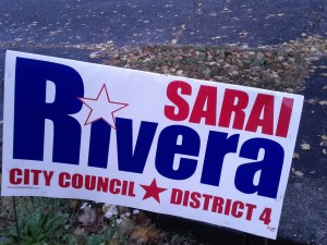
Sarai Rivera
Another nice way to add visual interest without adding any crazy little pictures: the starred I. Two stars to the unchallenged incumbent.
City Council, District 5
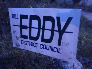
Bill Eddy
As usual, this year every Eddy sign has been vandalized so as to strike out the candidate’s name. Recently it was suggested to me that this was a “false flag” operation, and that the strikeout is printed on the sign itself. Is Bill Eddy an inside job?
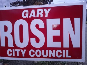
Gary Rosen
Rosen. Rose. Red. BOOM. The word ROSEN is as large as possible. The rest of the sign is tasteful and laid-back, with the Gary italicized to keep things from being completely boring. The best of this year’s signs. Zero stars.
School Committee
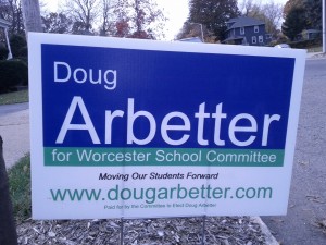
Doug Arbetter
So many words on this sign. I kinda like the idea of including an entire manifesto on a sign, for passersby with a few minutes to spend, but it would probably be better to just staple a printout of the manifesto to the sign and let the sign itself deliver the basics in a strong manner. This would be a way better sign if the last three lines, which are unreadable to most of the people driving past anyway, were deleted.
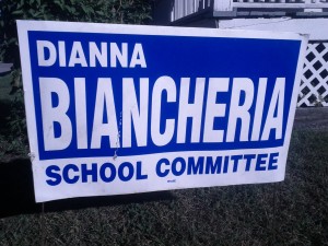
Dianna Biancheria
Just nice and simple. I support this sign.
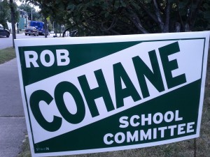
Rob Cohane
The first of the “diagonal name” signs that I don’t like. Whereas on Palmieri’s sign the words are drifting free, having fun, in these signs the name is trapped between lines of geometric precision, forced into an angle of eternal tension. These signs remind me of the flag of Trinidad, or diver down, or the abandoned building sign, all of which I like, none of which have anything to do with these candidates. I don’t think the dark green is a great choice, because at dawn and dusk it comes off as black.
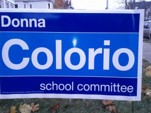
Donna Colorio
I really love this sign. Colorio. Cool. Color. Soothing blues and Helvetica. I think Rosen’s sign makes a better impact, but if I had to have a sign in my yard year-round, this would be the one. (The candidate’s Tea Party politics notwithstanding.)
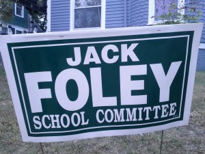
Jack Foley
This sign is fine. As mentioned above, I don’t like the dark green here.
John Monfredo
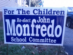
“For the children.” Condescending to the voters, insulting to the other candidates. The worst sign.
Brian O’Connell
I have photographed O’Connell signs in the past, but haven’t seen any this election. Always a popular candidate and an example of the adage that “signs don’t vote.”
Tracy Novick
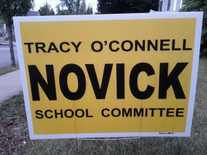
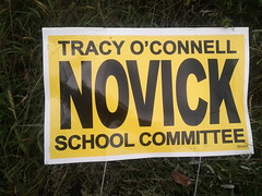
The visibility of a highway sign, and the colors of a school bus. Somehow it’s balanced so that it doesn’t come off as harsh. Like Gary Rosen owning the color red, Novick owns yellow. I don’t like the letter spacing of this year’s sign as much as last year’s, below.
Hilda Ramirez
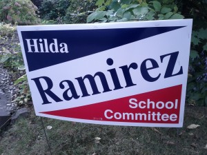
Another diagonal sign. At least it’s not dark green.
See also:
Gaffney is in fact the ad on the back of my phone-book.
Konnie Lukes’ signs remind me so much of former NH Congressman Charlie Bass’ signs, which were orange letters on a navy background and simply said “Bass” in all caps. Southern New Hampshire folks will know what I’m talking about!
I will try to snap a picture of an alternative Beshir sign (Mesfin 4 Worcester, which makes it seem as if he’s running in D4) which I saw in Shrewsbury (!). I also LOVE the Palmieri signs with his picture on them.