Election lawn signs. So many candidates, so many styles. What could they mean? Let’s take a guess.
City Council: At Large
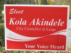
Kola Akindele takes his strange name and turns it into instant name recognition. The sign to beat.
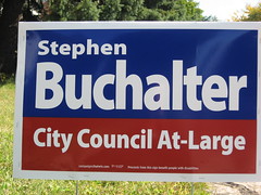
Stephen Buchalter‘s sign is nice and clean–almost as simple as it gets. Mostly blue on top of some red–he’s a Democrat with a Republican foundation?
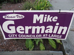
Mike Germain signs have been hard to find for most of the election. This one is from the last election. Saw one while driving this week; IIRC very similar to this. Weird color, mix of fonts. A sign designed by committee?
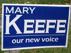
Mary Keefe has a sign as clean as Buchalter’s, with a slogan (“our new voice”) that lets people know she’s a challenger and connected to the grassroots. Hers is serifed, his is not–different visual identities. Her all-blue sign leaves no doubt as to her political sympathies.
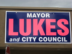
Konnie Lukes has slight variations of color between her bold signs, all of them in weird combinations. Is this pink + navy a commentary on being a strong woman in a male-dominated system, or just a poor choice?
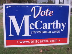
William McCarthy is arguably the rightmost candidate for the Council; this mostly-blue sign is only credible in a state like Massachusetts, where Democrats-In-Name-Only are commonplace. One too many fonts. The “billcares.com” URL insults the intelligence of the voters and the character of his opponents. McCarthy isn’t a memorable name, especially in a city of Irish pols like this one, so why accentuate the “M”? Nobody will think, “oh yeah, the M guy” at the polls.
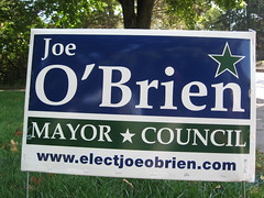
Joe O’Brien has a traditional sign that’s a little forgettable in the context of this race. Dark blue + some dark green = a Democrat with progressive values. Two stars, a prominent URL. Similar to Joff Smith, below.
(Radford notes this is in Palatino.)
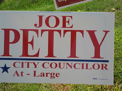
Joe Petty. The “quiet man.” A mostly white sign, with red too-thin letters appearing out of the mist. A conservative with a liberal streak? Also a star.
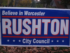
Rick Rushton‘s sign is a bit bland for this election. Makes no secret of his Democratic feelings; the red lines might symbolize conservative streaks or just be a nice visual idea lifted from the flag of Israel. The slogan “Believe in Worcester” makes this the sunniest of signs.
A photo of Kate Toomey‘s sign is on my other camera. I remember “bold” and “yellow.”
Haven’t seen any Emmanuel Tsitsilianos signs. He’s either not a force in my part of the city, or his campaign has made the bold move to post no signs.
City Council: District 1
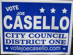
Challenger Joe Casello wants to be seen as a straight-up, 5-star Democrat. The spacing between “Vote,” “Joe,” and “Casello” seems off.
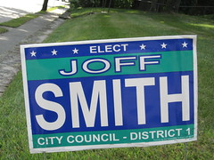
Incumbent Joff Smith sticks to a single font, varied as needed. Shows his progressive colors with plenty of green, and his incumbent strength with a Casello-beating 6 stars.
City Council: District 2
Phil Palmieri running unopposed. I rarely head up Shrewsbury St, and haven’t seen his 2009 signs.
City Council: District 3
Incumbent Paul Clancy vs. Frank Beshai. Have seen their signs, no photos though.
City Council: District 4
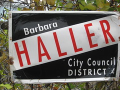
Barbara Haller is the incumbent in this perennial hard-fought district race. Black + white + red is as classic a color combo as there is. I’ve always found her signs more harsh than elegant; her supporters might say “outspoken” and “energetic.” Hasn’t changed much in recent years, yet one of the more memorable 2009 signs.
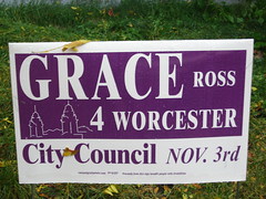
Challenger Grace Ross, whose 2007 at-large campaign I worked on, also has a memorable sign I don’t like. Parts of the letters are too thin, the purple doesn’t look good on a lawn sign (exception: Prince’s lawn), the picture of Union Station has no emotional charge. The previous signs were similar, with blue instead of purple. Is the purple a sign of liberalism mixed with conservatism, or a “third way” approach?
City Council: District 5
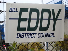
Bill Eddy is running unopposed; nonetheless, some wag has been distributing these anti-incumbent Eddy signs. Judging by their popularity, the right challenger could run a strong race in D5.
School Committee
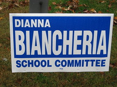
Challenger Dianna Biancheria is all blue. Should talk to Buchalter on how to have a clean sign without being bland.
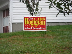
Incumbent Bob Bogigian has a distinctive sign that’s not very readable. Matches Joff Smith star-for-star.
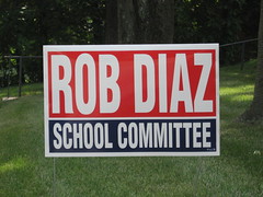
Challenger Rob Diaz wants to look like a conservative who understands the liberal perspective. Another Buchalter-like sign in need of interest.
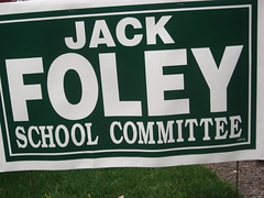
Incumbent Jack Foley has a dark green sign. What is the political import of this? Alex Steffen says that dark greens “tend to emphasize the need to pull back from consumerism . . . and emphasize local solutions, short supply chains and direct connection to the land.” I attended one School Committee debate, and did not hear Foley articulate his views quite this way.
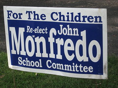
Incumbent John Monfredo‘s blue sign is too busy for the distinctive font he uses. The slogan “For the Children” feels condescending.
I don’t think I’ve seen incumbent Mary Mullaney‘s signs.
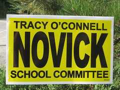
Challenger Tracy Novick attempts the high contrast black-on-yellow of highway signs and pulls it off. A pleasant, extraordinarily readable sign. If Akindele has the best sign of 2009, Novick is a strong second place.
Buchalter and Keefe are tied for third. Either the incumbents are getting soft, or good signs turn off Worcester voters.
Don’t recall seeing signs from incumbent Brian O’Connell.
phil will be opposed by Frank raffa on stickers
Joe O’Brien’s use of the flabby, ungainly typeface Palatino is only playing into the hands of conservative opponents who seek to portray progressives as weak and ineffective.
Note: Stop Using Palatino.
I wish you’d posted pictures of the Clancy & Beshai signs. I’m normally not a big fan of anything but a sans-serif font in political signs, but the Beshai sign is really distinctive and memorable. And about as quirky as his eyeglasses.
Love the Eddy comment — I’ve always taken those signs to be a little bit self-effacing…like, vote for me, unless you just want to cross my name off the list altogether…
Such signs shouldn’t just be evaluated on design/color but on whether they’re readble from 100 feet away in a moving vehicle. By the latter standard, Kola’s signs fail to do anything but make you want a carbonated soft drink.
For the record, my wife designed the O’Brien sign back in 01 when he ran for school committee. I think its flawless and sharp, visible and readable from afar, also, the star is reminiscent of a star on the rise. Don’t recall if the originals were palatino or not. the green is obvious, to crassly appeal to Irish voters. I might have even suggested a shamrock back in the day.
For all your praise of various signs though Mike, the clarity and density are the most important. kola has great signs, but his first batch were unreadable, looked like advertisements to the untrained eye, the second batch enlarged the “kola.”, but too late perhaps? If signs are scattered too thinly, or worn down, another demerit. Lukes and Rosen deserve credit, because their signs postively glare, and fix the candidates name in your brain. Rosen had hundreds upon hundreds of locations on the west side last election, and that is the purpose of these things, to market the name, to make it seem inevitable
one last point while on my sign kick here, no mention of the giant signs. here, Joe is again clearly the winner. the guy has giant signs at key locations, shrewsbury street, tatnuck square, cambridge and canterbury. Of all campaigns in recent history though, Glodis emerges the sign king. Guy had gargantuan, professional signs everywhere in Worcester county. readable and clear, omnipresent.
Related: Designing Obama.
Such great comments on this post. Thanks to all for taking the time to read and respond!
Thanks for this great lighthearted take on local campaign signs. I do a fair amount of political design work in Alaska and I have to say… the bar is set very, very low. I don’t know how many signs I’ve seen that are hopelessly garbled, printed in strange, strange colors, or use terrible skinny serif fonts, etc. etc. etc. It’s like political logo design is some wretched backwater that very few decent designers are willing to dip even a toe into.