See also: 2009 signs, 2009 candidate websites, 2007 candidate websites. I’ll update this entry as I see more signs. Readability claims are based on my walking around the city with my glasses off.
State Senate
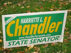
Harriete Chandler (D, incumbent): The green says “progressive.” Combined with the yellow, this is maybe the most low-profile sign of the election. The Worcester Planning Board is considering restrictions on political lawn signs–maybe this campaign is reading the winds and deciding that the voters at large are tiring of looking at signs?
District 13 (State Rep)
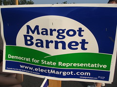
Margot Barnet (Democrat): The moon rising over green hills–goth environmentalism? A midnight blue sky to establish loyalty to the Democrats. One reader wrote in to say the hills look like a butt. I think this says more about the observer than the designer.
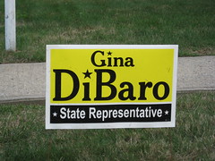
Gina DiBaro (D): Reminiscent of Tracy Novick’s super-readable sign from the last election. This one is a little less readable and a little more pleasant. Is dotting i’s with symbols a feminine touch?****
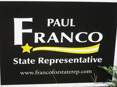
Paul Franco (Republican): The most striking sign. No red or blue! The shooting star echoes the general astronomy theme of this year’s crop of signs. Says either “something new” or “something fleeting.” The F in Franco feels too big and there is some sort of spacing or balance problem. *
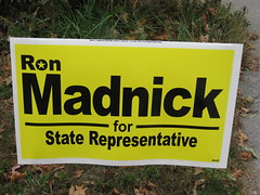
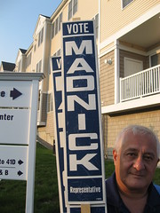
Ron Madnick (independent): Wow! Taking the DiBaro/Novick “elegant highway sign” design to the next level with a discreet star. *
Early in the election, Ron didn’t have any lawn signs, but did have these sweet numbers (below) from when he ran for this same office in 1974. Hands-down winner in the “Classic Americana” category.
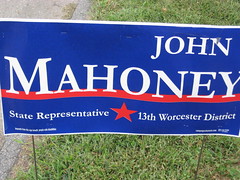
John Mahoney (D): This sign says “confident Democrat.” I like the letters inching onto the red line. Professional but not bland. This is how Franco’s sign should have presented his name. *
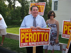
Mike Perotto (D): This sign says “aggressive Republican.” The color choice hurts readability, but also sets the sign apart.
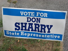
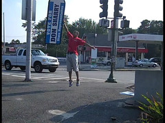
Don Sharry (D): Nice Democratic sign. Most notably, this campaign has hired sign-twirlers:
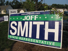
Joff Smith (D): A better iteration of his 2009 City Council sign. Still says “progressive Democrat” but without the outlined “Joff” which was kind of ugly. The Smith campaign has made conspicuous use of these gigantic signs, which I hope they will donate to the Red Cross for use in emergency shelter after the campaign. ******
District 3 (US Rep)
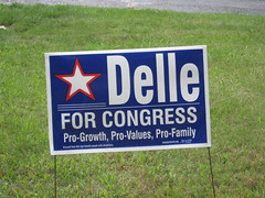
Robert Delle (R): The colors say “Democrat.” The “Pro-Growth, Pro-Values, Pro-Family” tagline is a bunch of code words whose plain meaning insults the voter. (His opponents are nihilists?) Delle campaign, you win Worst Sign. *
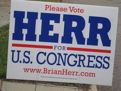
Brian Herr (R): Clean, professional. Strong presentation of a short last name. Nice font. The “Please Vote” wins this Most Polite and also Best Sign.
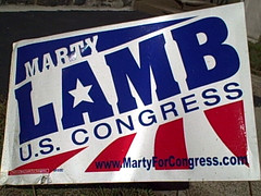
Marty Lamb (R): I like the jaunty angle of this sign. The red and white curving road is a huge Obama reference, helping this sign to say something like “political moderation/self-discipline/empty promises.” Hard to find these signs in the city of Worcester–his supporters must mostly live elsewhere. *

Jim McGovern (D, incumbent): Very straighforward red, white, and blue, with obvious emphasis on the latter. The most interesting thing is the “Another family for…” bit.
- It’s reminiscent of the many interest-specific Obama graphics. Can we expect to see “Another firefighter for…” or “Another birdwatcher for…” or “Another senior for…”?
- I think the typeface is Chalkboard, but it might as well be Comic Sans. Adding something crappy-looking like this is a real “power move” that says “I’m a long-time incumbent with credibility to burn.”
Sheriff
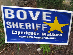
Scot Bove (D): A blue sign, a five-pointed star. “Experience matters” is a decent tag line. *
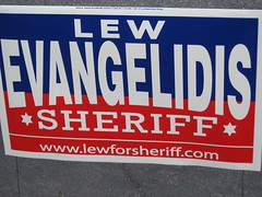
Lew Evangelidis (R): Both blue and red, six-pointed stars. Nice presentation of a long last name. **
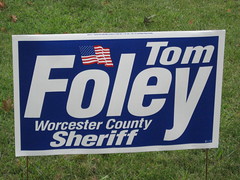
Tom Foley (D): This candidate is an American citizen. **************************************************
State Treasurer
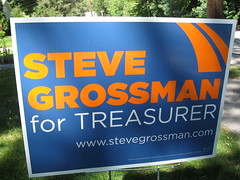
Steve Grossman (D): Orange! The stripes are either a highway or the start of Franco’s shooting star.
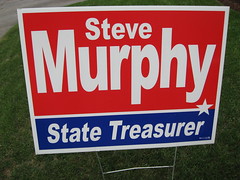
Steve Murphy (D): A nice sign, maybe a bit boring. The shoooting star is subtle.
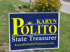
Karyn Polito (R): We round out our astronomy theme with the sun. The P in Polito feels a little unbalanced, and the lines feel crowded. Not bad. *
Auditor
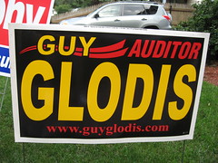
Guy Glodis: Franco’s shooting star passed through here. The black background makes this calmer than Perotto’s yellow-and-red. His sheriff campaign signs had this cool so-large-only-part-of-it-fits-on-the-sign sheriff’s badge–no sign of that freshness and flair here.
Attorney General

Jim McKenna (R, write-in): This charming hand-made sign is better than many of the industrially-printed ones! Enough red to make his politics clear. Consistent use of the lowercase-i appeals to my picky side.
Secretary of State

Bill Campbell (R): Another clean, professional sign. My favorite star of all the signs. *
Governor’s Council
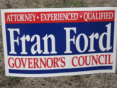
Fran Ford: Nothing wrong with this. Typeface interesting without being distracting. The “Attorney/Experienced/Qualified” tagline is the most informative of the campaign, and boldly proclaims something (that the candidate is a lawyer) that’s a negative to some. Good job staying on the offensive. **
Governor/Lieutenant Governor
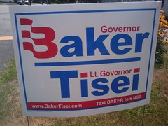
Charles Baker/Richard Tisei (R): The flag “B” only makes sense close up–from a distance, I thought it was a printing error. The red dots in Tisei look crummy next to DiBaro’s stars. I guess the “Text BAKER” bit is interesting, but overall this is an unprofessional sign.
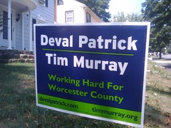
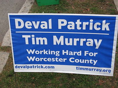
Deval Patrick/Tim Murray (D, incumbents): Two variants of this sign, one for Democratic loyalists, the other for progressives. Is there a version for each county? Note that both members of the ticket have their own websites. A sign of an ambitious Lieutenant Governor?
Love, love, love these posts.
I’ve found Marty Lamb’s signs interesting but tough to read while driving. (Though that indicates that I need to start wearing the contacts with the stronger prescription, rather than anything about his design.)
I’d also love to see you do a similar post for lawn signs for various city festivals (Irish Music, Middle Eastern, stART on the Street, Grecian, Albanian, etc.) I have my own opinions on the signs, but I’d like to hear your take.
I like all the references to Franco’s sign. You might not have liked it but it sure made an impact. You won’t forget his name!
Thanks for yout take on these signs and a comprehensive set of pictures of them.
Like another commenter, I really like the Franco sign! I favor minimalism, so I wouldn’t have put the first name and then the last name could have all been as big as the “F” that began his surname. Otherwise, it is striking and that’s necessary to get a voter’s attention.