Today’s the preliminary election, and I haven’t even seen signs for several candidates, so you can be sure that this analysis will be updated as the final election approaches.
City Council: At-Large
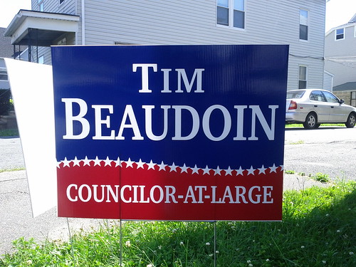
Tim Beaudoin
Red and blue with a curvy border: a Pepsi feel, turned political with the addition of stars. Score: a mighty 26 stars.
Stephen Buchalter
Some candidates would be tempted to make the letters narrower; Buchalter plays with the leading, crowding the letters together in a pleasant way that sets this sign apart. Score: No stars.
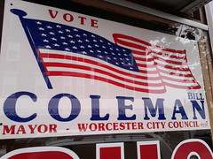
Bill Coleman
Among Candidate Coleman’s many passions is painting large flags—great to see one on his sign. Score: Fifty stars.
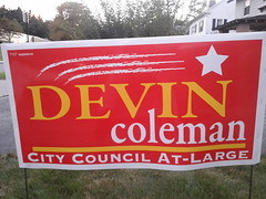
Devin Coleman
This young candidate’s sign says both “Youthful dynamism” and “Wolverine was here.” Score: One shooting star.
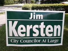
Jim Kersten
A perfectly pleasant and simple sign, without being so minimalist as Konnie Lukes’s (below). The dark green looks great against lawns and foliage now—time will tell how it lasts into November. Score: No stars.
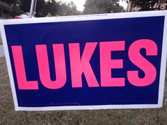
Konnie Lukes
The shocking color combination of hot-pink-on-navy-blue makes the point that Konnie is a strong woman in a man’s world. I really like the confidence of this sign. “If you’re a Worcester voter, you know who I am and what I’m running for.” Score: No stars.
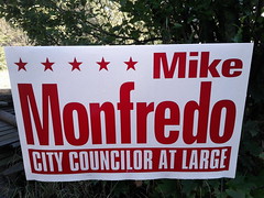
Mike Monfredo
The red makes it clear that this is not a John “My sign is blue” Monfredo sign. I don’t think “Monfredo” is a long enough last name to deserve the narrow letters treatment. Score: Five stars.
Joe O’Brien
If you’ve got an apostrophe, why not flaunt it? I like the details here, like the colors that say “Progressive Irish Democrat” and the green star that’s journeyed up to balance out “Joe.” Score: Two stars.
Joe Petty
This photo does not show how bad this sign is from a distance. I think it’s the extreme contrast of the wide and thin strokes of the letters, and the hefty serifs, combined with the dark line too close to “PETTY”, that make this a bit washed out from some angles. I’m sure this sign is lousy for the same reason he doesn’t have a website—Joe Petty knows nobody is voting for or against a longtime incumbent based on a sign or a blog. Score: One star.
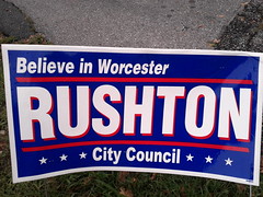
Rick Rushton
The most controversial sign this year. People in Worcester do not, by-and-large, “Believe in Worcester,” instead holding that the city’s best days are far in the past, and were never that great, anyway. Rushton begs to differ. Score: Six stars.
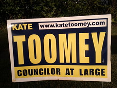
Kate Toomey
Kate has been the councilor most active online in recent years—the URL on this well-worn sign speaks of a time when a Worcester candidate website was the exception, not the rule. The yellow may symbolize her extreme sunniness breaking through the Democratic blue background. Score: No stars.
City Council: District One
Tony Economou
People talk about politicians wrapping themselves in the flag—this one is taking shelter beneath it. The implied topology makes my head hurt. Score: Four stars.
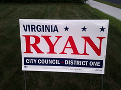
Virginia Ryan
This risks being too sparse like Petty’s, but the dividing bar is a respectful distance from “RYAN”, which helps. The stars at top add both balance and busy-ness. Score: Four stars.
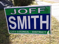
Joff Smith
There are at least two Joff Smith designs out there. Does he distribute a slight revision each campaign? Please e-mail pieandcoffee@gmail.com if you can provide positive dating on the first year any of these signs was used. Score: Zero to six stars, depending.
District Two
Councilor Palpatine

The incumbent is running unopposed, and I haven’t seen any signs around town. I found this one on the internet.
City Council: District Four
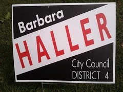
Barbara Haller
Bold and a bit harsh, like the woman herself. The proportions of “HALLER” aren’t quite right—this sign would be improved by un-squooshing the letters. Most of all, this sign reminds me of an inverted Trinidad flag. Another incumbent who knows that tweaking her sign election-to-election won’t win a single vote. Score: No stars.
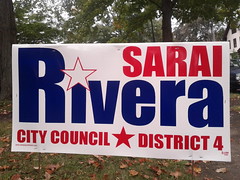
Sarai Rivera
The challenger goes for a pleasant sign with a nice star-as-punctuation. Score: Two stars.
District Five
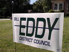
Bill Eddy
Councilor Eddy continues to indulge in the irony of a sign that looks, from many angles, like his name is crossed out. You never know if the person displaying this likes him or hates him—and that’s the fun. Grade: No stars.
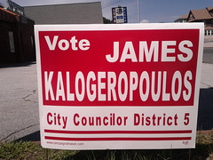
James Kalogeropoulos
Varying the font widths this much looks cheap, but the smashed-up “Kalogeropoulos” gets across the central message, “It’s that guy with the long name.” Or, more briefly, “It’s not Bill Eddy.” Score: No stars.
School Committee
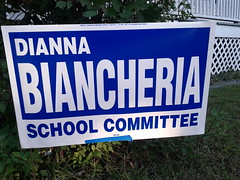
Dianna Biancheria
A simple sign with the popular long-name-in-narrow-letters combo. Score: No stars.
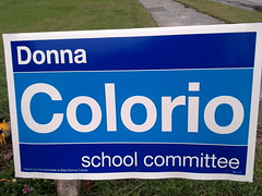
Donna Colorio
Signs like this are why people love Helvetica. The white lines are thin enough to divide the sign without hurting readability, and the two-tone blue background adds to the classy, understated vibe. Who would guess that she was a Tea Partier? Grade: No stars. (NB It’s possible this is some Helvetica rip-off; I am by no means the master of typefaces.)
John Monfredo
“For The Children.” I hate this sign so much. Who’s against children? The sort of cheap shot that insults both the candidate’s opponents and the potential voter. The capitalized “The” is perfect. Score: No stars and “Fuck you.”
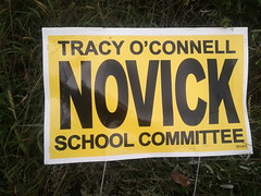
Tracy Novick
All the good points of a highway sign, and none of the bad. Score: No stars, but still a favorite of mine.
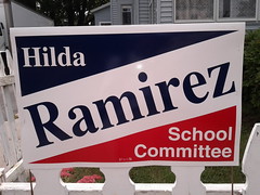
Hilda Ramirez
The challenger stands out with a diagonal name and all-American colors. Score: No stars.
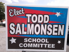
Todd Salmonsen
Campaign sign or fireworks ad? Score: Three stars.
The logo for Gabe Rollins’s ill-fated campaign remains the best graphic of the election:

See also:






2 thoughts on “Worcester election signs, 2011”