For past years, see the lawn sign roundups for 2007, 2009 (also 2009 websites), 2010, 2011, 2013, 2015, 2019, 2021, and 2023 ([prelims}(https://www.pieandcoffee.org/2023/09/04/worcester-preliminary-election-lawn-signs-2023/), general).
There’s a preliminary election this week, different from a primary in that it’s just designed to winnow one of the School Committee races down to two candidates, and winnow Council-At-Large down to twelve. So not every Council or School Committee election needs a prelim.
(I couldn’t find any Bernard Philip Iandoli signs in the wild, so they are omitted here.)
City Council At-Large
Moe Bergman

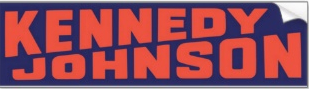
Every year these signs look too Halloween when they appear late-summer, and every year they seem perfectly appropriate by Election Day in early November. The angled and compressed BERGMAN makes me feel tense, and in some of his recent campaign material they keep the angle but expand the font, which feels much better. But Bergman’s public image is not about being cool, it’s not about being relaxed, it’s about being focused, and this sign doesn’t do a bad job making you feel that. Bergman says this was inspired by a Kennedy/Johnson sign, perhaps the one below.
(For the general election I’ll snap a new photo of his sign; here, I present a photo taken in a previous year, which reflects the signs I’ve seen around town.)
Donna Colorio

Colorio. Cool. Color. Soothing blues and sans serif goodness. (I used to think this was Helvetica, but it’s not, maybe ITC Avant Garde Gothic Paneuropean Bold?) The center stripe is desaturated, maintaining the mellow vibe. The tilted star over the “i” says “Somebody spent some time on this without being too fancy.” In contemporary American political iconography, blue is the color of the center left, but in Worcester political campaigns, that went out the window a long time ago.
(For the general election I’ll snap a new photo of this sign; here, I present a photo taken in a previous year, which reflects the signs I’ve seen around town.)
Cayden Davis

I grew up in an area where my last name was odd and hard for people to spell or remember, so I am very interested in how these lawn signs handle unconventional names. This sign leans on the extremely conventional DAVIS and, while not shying away from the CAYDEN, lets it fade into the background. Likewise, the bands of color reflect those of the 2018 Progress Pride Flag, appropriate for a trans candidate, but those bands are also very thin, not shying away from the issue but not having it dominate the entire sign, either.
Jermoh Kamara

Sticking with the pink theme from previous runs, and sticking with having a photo of her, too. Here the unconventional first name is small, the unconventional last name is the branding. I appreciate that her clothes and earrings are white, thus keeping the color scheme simple. I’d be curious to hear from campaign staffers or candidates what inspires some to include URLs on yard signs, when so many candidates skip them.
Khrystian King

Everyone whose last name is 4-6 letters long is so lucky, they can print it on the sign nice and big. Here it’s in bold, all-caps slab serif, while his first name is mixed-case script. Seriousness and fun. This year I have wondered if making his first name actively hard to read is a mistake, are there people who find this sign a bit frustrating? The stars are nice, adding an extra color and keeping the sign loose.
Charles Luster

I don’t really like slogans on yard signs, but if you’re going to include one, I like this style, make the sign almost more about the slogan than the candidate. This is a nice green that works well with lawns, though by November maybe that won’t be as true. Putting the “2025” on there is a real commitment, this isn’t a sign you’re going to reuse next time.
Dr. Satya Mitra

This is my favorite challenger sign, though I’m having trouble figuring out why. Maybe it’s just so darn readable? It even omits the hyphen from “AT-LARGE.” Who needs that visual clutter? This sign wants you to pay a bit more attention to his last name than his first, though there’s also that “Dr.” (biochemistry) in there. Anyone reading this who is a Ph.D., I am curious: when do you use “Dr.” as your title and when do you skip it?
Edson Montero

This is the only Montero sign I’ve seen this year, a leftover from his run for District Councilor last election. This color scheme, that drawing of hands, and the lack of a period at the end of the slogan, that’s three things about this sign that throw me. Which isn’t necessarily a bad thing, and if you’re going to throw me, you might as well go whole hog.
Jessica R. Pepple

I like how some local pols are able to “own” a primary or secondary color in their branding, and here Dr. (educational leadership & policy studies) Pepple of course goes for purple, playing up her uncommmon last name. When Kola Akindele ran, he had signs that played with the Coca-Cola logo, and it’s been suggested that Pepple could have done something similar with Dr. Pepper, but that seems too silly to me.


Joe Petty

A lawn sign that’s been around a long time, that basically gets the job done, that could be improved a lot if the candidate cared about things like graphic design, and hasn’t because he doesn’t. This remains a pretty good reflection of Petty’s political image.
Gary Rosen

Rosen, rose, the color red. Very simple and with some rough edges, a sign from a previous era, not quite cool enough to be retro, but in no way tacky.
(For the general election I’ll snap a new photo of his sign; here, I present a photo taken in a previous year, which reflects the signs I’ve seen around town.)
Owura-Kwaku Sarkodieh

Red, white, and blue. And, like Montero’s sign, yellow for some reason. I’d like to see people with long (>6 letters) last names not use compressed text, in fact use bold text. You could argue making the letters tall and skinny makes it easier to read than short and normally-proportioned, or you could argue the reverse, but you’d can’t argue that compressed text doesn’t feel tense, at least on the lawn signs I’ve seen.
Kate Toomey

A little like the Lakers colors, but more navy blue and less purple. This is a very sunny sign, sunnier than some signs that contain an actual sun. TOOMEY is compressed but doesn’t bug me much here. Like Rosen’s sign, something from a previous era. Unlike Rosen’s sign (and most of the rest), omits the hyphen from “At-Large.”
(For the general election I’ll snap a new photo of his sign; here, I present a photo taken in a previous year, which reflects the signs I’ve seen around town.)
School Committee District E
Noelia M. Chafoya

I don’t like the social media tags on yard signs, in part because it’s so unlikely I’m going to go on social media while driving or walking around town. But I also have no idea how the average Worcester voter in 2025 is learning about candidates, maybe those tags are key. This color combo is very nice! As I considered whether the book + lightbulb were good or bad here (answer: mildly good), I started looking at that “Vote,” which if you leaned into it a little more could be very 80s, and could you make the entire sign 80s, and have a vaporwave yard sign? I guess that’s the sort of thing you’d make one of, and post it to social media, rather than making your supporters’ neighbors mad by having to look at this harsh little rectangle for two months.

Nelly Medina

This remains a pleasant and sunny sign, red + white + blue, with a lot of whitespace and slightly desaturated colors. The hyphens around “Nelly” don’t add much for me, and the collision of the “y” with the “N” actively annoys me. If you are going to use something like that as a fun element, I want you to use several other fun elements on the sign, otherwise this is just going to look like a misprint.
Kathy Roy

Why, in a country where “blue” tends to connote “center-left,” does everyone who sees this ask me, “Does this have something to do with the police?” It probably has to do with the dark blue at the top and bottom, and the light blue cueing you into seeing the dark blue as blue rather than black. Combined with the all-caps serifed lettering that feels official or at least formal. Combined especially with the giant field of stars at the bottom, which you might believe are subtle enough that you are the only one to notice them at a glance, but believe me, everyone notices them. Like Montero’s sign, this not only has janky elements, it has lots of janky elements. The double outlines, the color gradient, the mystery of why “District” is the only word not all-caps, this is a sign I will remember seeing all day, whether I want to or not.
How many stars, though?! ?