For past years, see the lawn sign roundups for 2007, 2009 (also 2009 websites), 2010, 2011, 2013, 2015, and 2019.
I’ll start by saying that I hope criticism of the signs is not seen as criticism of the people running or their teams. A campaign is a lot of work; lawn sign design is not remotely the most important thing; sometimes you gotta get those signs printed and you just go with what you have.
City Council At-Large + Mayor
To be the mayor, you must be elected a City Councilor At-Large, as well as win the mayor’s race.
Mayor Joseph M. Petty
I’ve complained about the awkwardness of this sign before, and how easy it would be to fix, but you know what? Whatever. This sign is perfect. Joe Petty is sort of the Joe Biden of Worcester, elected because people were looking for an alternative to the incumbent, and he was available. Unlike any recent candidate for POTUS, he’s been a relatively humble, unambitious leader who keeps his head down and focuses on the fundamentals. Our City Councilors are “LARPing ombudsmen.” Petty realizes this and acts it. And I think Worcester is the better for it. So I’m sure he’s considered a sign redesign, but what’s the point? Joe does not crave the limelight or a cool sign. Rating: Two stars.

Peter A. Stefan
This is the only Stefan sign I’ve seen, appropriately in front of his funeral home. I don’t think the stylized portrait would work for other candidates, but for an unconventional guy like Peter, it’s perfect. Rating: Zero stars.

Bill Coleman
At one time Bill was best known for getting giant American flags painted on fences and other public places, so in his case the flag is not just a symbol of America, but part of his brand. Lest my kind words above for Joe Petty make you think I’m endorsing him, I will, as always, endorse Bill Coleman for mayor. Rating: Fifty stars.

Councilor Donna M. Colorio
Colorio. Cool. Color. Soothing blues and Helvetica. The center stripe on the newer Colorio signs is desaturated, no longer a bright blue, echoing the ways the mood in our city and nation is darker than it was two years ago. Still a really solid sign, with the tilted star over the “i” enough to say “Somebody spent some time on this” without being too fancy. Rating: One star.


Above: The old version, photographed 2021.
Councilor-at-Large
Councilor Morris A. Bergman
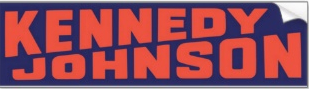
Here’s a good way to get your name larger on the sign, use the diagonal. A very autumnal and Halloween-appropriate design. Moe says it was inspired by a Kennedy/Johnson sign, perhaps the one below. He’s added “Re-Elect” on there and it still looks great. A versatile layout. Rating: Zero stars.

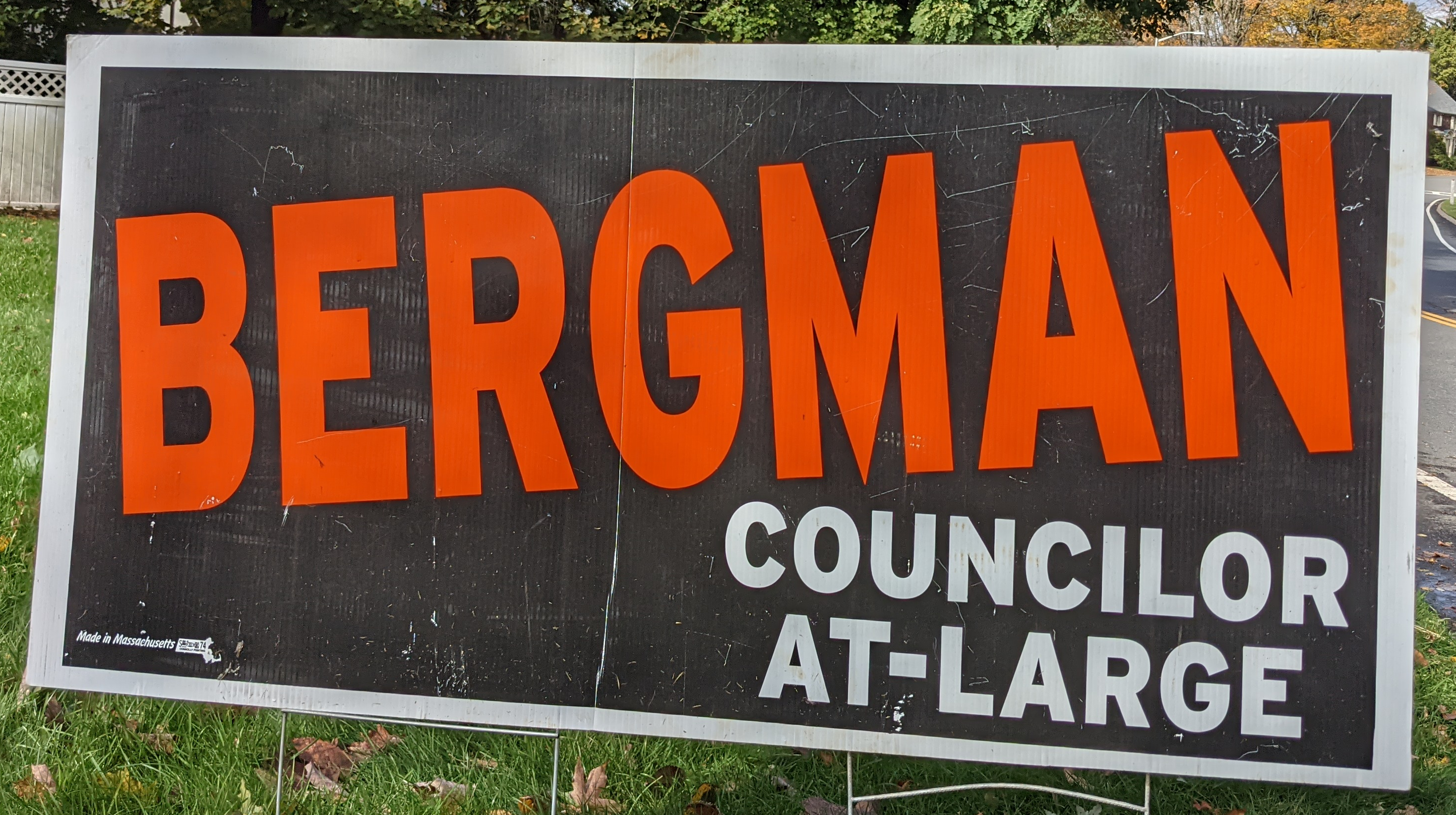
Above: The old version, photographed 2021.
Councilor Kate Toomey
This color combination always reminds me of the Lakers, though her blue is both darker and less purple. These signs also remind me of bright sunshine overcoming a dark night. Kate’s public persona is not as sunny as it once was, but there’s no harm in sticking with that message. Rating: Zero stars.

Thu Nguyen
Here is a good sign, with the candidate’s name very legible. The shadow behind “Thu” adds just enough interest to avoid being boring without being slick. This year there is a trend of using hearts rather than stars. Replacing red with pink softens the sign a little. Replacing a star with a heart softens things a little. This is a very gentle sign. Rating: Zero stars, one heart.

Guillermo Creamer, Jr
This sign messes with my brain. When I see it, my eye hits the “G,” then the “O” which looks like a backwards “G,” then expects other parts of the sign to be mirrored, then is surprised when they are not. This happens every time. My eye is Charlie Brown, this sign is Lucy with the football. My favorite sign of the year. Rating: Zero stars, one heart. Minus a million points for using the word “Woo.”

Councilor Matthew E. Wally
Not a lot of green on the signs this year. Maybe this color signals progressive values, maybe it appeals to Irish voters, maybe it just looks good against people’s lawns. Rating: Zero stars, a bunch of lines.

Councilor Khrystian E. King
The first name in script, the last name sans-serif. This says the person doesn’t take themselves too seriously, but is serious about the job. Everyone whose last name is 4-6 letters long is so lucky, it’s no trouble to print it on the sign nice and big. Rating: Zero stars.

District 1 Councilor
Councilor Sean M. Rose
Very legible. He’s got some of the red that goes with “rose.” For a long time Gary Rosen was the candidate with the red signs, but now that he’s retiring this feels up for grabs. Mero-Carlson has red signs, but Rose has the perfect last name, I think he could win that fight. Rating: Two stars.

Richard Cipro
This has the same problem as Petty’s sign: the font used for his last name has some pretty thin strokes, and is harder to read than it has to be. Additionally, all of the text below it is some combination of too small and too pale to read when driving by. “Dedicated, Proven Leadership” is lost on that last line. If you really wanted that text on there, you could simplify things and have something like “DEDICATED/PROVEN/CIPRO.” Having his last name on there so small feels like a bit of a humble gesture, but when you have a sign promoting yourself it’s probably ok to risk being seen as less than humble. Rating: Thirteen stars. Nice!


Above: The only candidate with “X for Y” signs I’ve seen this year. This design works better than his regular signs.
District 2 Councilor
Councilor Candy F. Mero-Carlson
One font, one star, a fun capital “C,” and an echo of Coca-Cola. This kind of reminds me of a logo for a tee-ball team in the 70s. I have only good associations with this sign. She negotiates the “compound surname problem” of fitting a giant last name on a sign by omitting the hyphen and running the first part small. The simplest solution. Rating: One star.

Johanna Hampton-Dance
This sign has two problems. First, it has too many fonts and weights, four or maybe five? Second, the words “Vote,” “For,” and “Worcester” are more prominent than the candidate’s name! The spacing is sort of weird but that’s not important to winning an election; name recognition is. Rating: Zero stars.

District 3 Councilor
Councilor George J. Russell
He’s running unopposed so he doesn’t have a lot of signs out there. My apologies for the poor quality of this photo, this one was behind a fogged-up window. I feel like critiquing this sign is like critiquing a condor, I should feel lucky just to have spotted one. Rating: Zero stars.

District 4 Councilor
Councilor Sarai Rivera
I haven’t seen any Rivera signs this year despite living in her district. (This photo is from 2019.) Very readable. It’s nice how the two stars feel connected, like the lower star was cut out of the upper star. Puerto Ricans are going appreciate the one white star, without anyone else feeling left out. Rating: Two stars.

District 5 Councilor
Gregory L. Stratman
A bold reference to “TRUMP” signs. Softened a bit by making the outer border white rather than red, moving the red to a couple of lines in the middle. A “TRUMP” sign would have lines of five or six stars, all the same size. This one has lines of seven, with one larger than the others. I think this is just too many stars, either make the whole border out of stars or cut back a bit. The candidate’s name is readable, but this is a way better design for a five-letter surname than an eight-letter one. Rating: Fifteen stars.

Etel Haxhiaj
I have only ever heard people refer to her by her first name, they find her last name so intimidating. So there’s the first name, very big, front and center. Making the first and last letters of her surname large is such a simple way to freshen things up. I think this is the first local sign to reference the ground and sky since Margo Barnet in 2010. My standard read is that the green represents a progressive foundation, the blue a willingness to work with the Democrats. That seems close enough to the mark in this case. Rating: Zero stars.

School Committee
Jermaine L. Johnson
This uses the same script-plus-sans-serif idea as King’s sign, but this sign does a better job of it. If you are going to add unnecessary words like “Vote,” this is how you do it, in the corner where it doesn’t distract from anything. The URL is hard to read but the red bar works as a design element, so I don’t think the text detracts from the overall look. Rating: Zero stars.

Committee Member Molly O. McCullough
The #1 simplest sign of the year. You can read her name, it does the job, end of story. She uses a slightly different design on some of her larger signs, which is less boring but somehow charmless. Rating: Zero stars.


Above: The larger sign design.
Susan M. Mailman
Here’s another solution for the compound surname problem: just run the whole thing, really big. The festive orange at the top and the bottom is a total surprise. Rating: Zero stars.

Jermoh V. Kamara
Here’s a sign where the “Vote” adds some visual interest rather than being distracting. One of two signs with a photo of the candidate. This is a nice photo, but it is small and the background adds clutter and overall this is not great. The URL is like the union printer logo, it’s really just there for people seeking it out, you don’t care if anyone else can read it. But you want everyone to take in that photo with just a glance, right? Rating: Zero stars.

Committee Member Laura B. Clancey
The black-and-burgundy is an unexpected combo. (Maybe it’s midnight blue?) By outlining the serifed words in black, she narrowly avoids the Petty-Cipro legibility problem. Omitting outlines from the stars helps them fade into the background. Rating: Two stars.

Committee Member Dianna L. Biancheria
Nearly as simple as McCullough’s. Nowhere near as readable. Both of them have ten-letter surnames. By making those letters a bit shorter, it would be a more effective sign. Rating: Zero stars.

Shanel C. Soucy
Every year candidates distribute unflattering pictures of themselves, and I don’t know why they do it. Photos on yard signs are a recent trend and still a bit edgy, but if you’re going to do it, you need to work with a professional photographer until you get a picture at least as good as this one, one that says “This candidate is a relaxed, relatable, charismatic person.” Her head is about 50% larger than Kamara’s and the background is cut away, your eye sees her and moves on, rather than having to scrutinize anything. Combo of blue and red elements allows a potentially-divisive candidate to signal a message of inclusion. Rating: Eighteen stars.

Also I will put this creepy election-related sign here. I do appreciate the Halloween vibe.

Committee Member Tracy O’Connell Novick
The visibility of a highway sign, and the colors of a school bus. A bold sign for a bold candidate. Rating: Zero stars.

Colorio used maybe Futura, not Helvetica?